Our new logo features an F-117. But it’s not because the Nighthawk is cool. There’s a whole story behind it and here it is, from Mauro Roder, who designed the new logo, polo shirts, patches and more…
As you may have already noticed, The Aviationist has a brand new logo.
It’s, basically, an F-117 Nighthawk planform with an embedded “A” (the “A” of The Aviationist). As opposed to the previous one, which was difficult to “see”, this one is clear at first glance and quite distinctive. We have started to use the new logo all around our website: the header has changed so as the headline images in our social networks channels. It already appears as a watermark in our video and photos too and will be featured on everything we produce. Gradually, you’ll get more used to our logo and the related branding but it’s nice to notice that the wide majority of our readers and followers (I’d say nearly 100 percent) have said they like the new logo because it’s “simple”, “effective” and “goes straight to the point”.
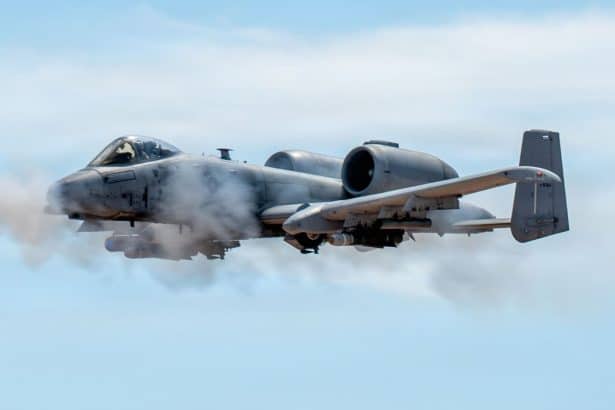
The timing for the unveiling of the new logo was only by accident coordinated with the F-117’s first “public appearance” at Fresno Yosemite International Airport last month. The fact that the U.S. Air Force is still flying the type out of Tonopah Test Range despite the F-117 has been officially retired in 2008 (!) is far from being a secret. But the U.S. Air Force has officially acknowledged the new aggressor role of the Nighthawk only after the Stealth Jet deployed to Fresno to undertake dissimilar air combat training with the local based F-15s in September. Just a few days before we unveiled the new F-117-themed logo.
Here’s our new logo. It has been in the works for some time now but we kept it secret so that we could unveil it in front of an audience of millions during the live broadcast for the 60th Anniversary of the Frecce Tricolori Airshow. #NoBetterTiming considered the recent events… pic.twitter.com/yLUTbgpYAz
— The Aviationist (@TheAviationist) September 21, 2021
However, the logo has been in the works for a long time. And the F-117 was chosen for very specific reasons that have just little to do with the Nighthawk sightings of the last years. Here’s the full story, told by Mauro Roder, the owner and product designer at OKB01, an Italian creative studio for military graphics and communications that, among the other things, has produced thousands patches and memorabilia for military units from all around the world.
“The need for a restyling of the image of The Aviationist was communicated to me by David at the end of winter 2019,” Mauro explains. “A qualitative leap was necessary to adequately present the site in a better way and in a short time we focused on the main problem: the name was not linked to any logo or symbol. Over the years it looked like it was the logo itself. We were in a situation of “target fixation”: we did not know what we should change or even “how” without upsetting the identity of TheAviationist.”
“In April 2019 I began to focus attention on the “A” inscribed in a square: squat, with no ties to the aeronautical world. But this “A” was the must. Gradually the square disappeared but the ‘A’ remained “squat” despite some graphic changes aimed at representing the wakes of two aircraft. Useless effort. We froze this form conscious of not having reached a solution. COVID put the project on standby,” Roder says.
“At the end of December 2020 I reopened the file but I was dubious. It did not communicate. It was not part of the aviation world. However, I realized that the “squat” A could have been inscribed in the form of the mythical ‘Aurora’. But something wasn’t right. In fact talking to David we discarded the idea because “TheAviationist is not gossip…” and we couldn’t base the new image on something that is not certain. Therefore, I abandoned the TR-3 but not the “stealth” idea: extreme confidentiality and effectiveness inscribed in mythical and basic forms. The way was set: I started scribbling the “A” with a greater inclination of both legs and … The A became the Have Blue. But the Have Blue does not convey the successful idea of an operational and technological concept. The F-117 does. The step was immediate and the “A” adapted perfectly to the shape which, for David’s and my generation, meant an aeronautical and “emotional” culture shock. That aircraft was the champion: the others came later. Furthermore, from the point of view of visual communication – therefore speed of memorization – the merging between the letter and the stealth is an isosceles triangle: the simplest flat figure which transmits harmony and proportion. We obtained a logo which, by its nature, could not be more effective due to the extreme simplicity conjugated to the meanings of the aeronautical world.”
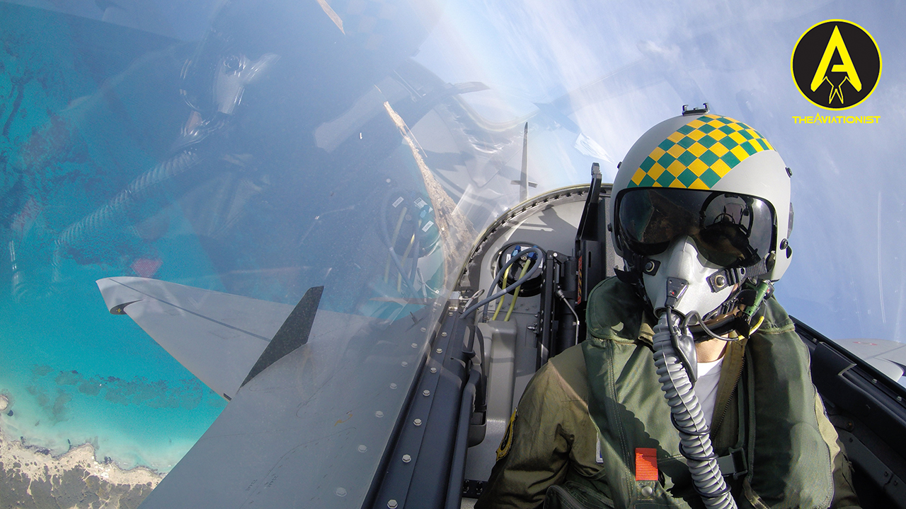
“These characteristics matched those of TheAviationist and David became enthusiastic about both the logo and the concept but it had to come full circle: merge the new logo with the name making it “aeronautically coherent”. And I did it by replacing the “A” in “TheAviationist” with the logo and changing the font aspect ratio of some letters. The rest has necessarily remained the same in order not to create disorientation in the eye of the reader. The cherry on the cake is represented by the yellow / green checkerboard (and the “discreet” version in gray tones), an aesthetic feature present on the flight helmet that David wears on his flights and which also represents TheAviationist’s ability to collaborate with multiple subjects: each gray square is a discrete source which then makes the information (the colored squares) public and complete. With these measures we have thus obtained a “revolution in tradition” through a continuum that is recognizable even after a very important restyling intervention also in the colors: yellow (attention / activity but also the color of David’s checkerboard) with black representing “the information still unknown” and the stealth world.”
As you know the new logo made its public appearance at the 60th Anniversary of the Frecce Tricolori airshow, where I wore a polo shirt with the new logo during the live TV show from Rivolto. But that was just the beginning.
“The live commentary from Rivolto was a “first” of the prototype of the new logo in front of an audience on millions people. As for the F-117, the “first” was preceded by a very long period of study, development and testing. We have much more surprises in pipeline featuring the new logo: beginning with polos, t-shirts, patches and more. So stay tuned!”
Indeed, watch this space for more announcements.